Book Review of "Graphic Fest, Identities for Festivals & Fairs"

Title: “Graphic Fest: Spot-on Identity for Festivals and Fairs”
Author: Victionary
Website: on the Victionary website
What’s this book about?
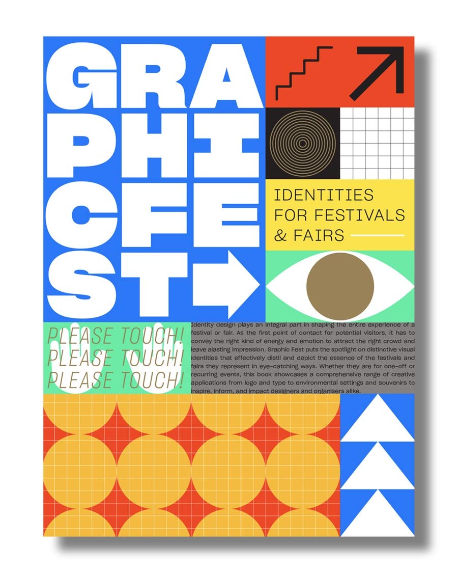
“Graphic Fest” is a colorful exploration of visual design systems that were created specifically for large-scale, in-person events like festivals and exhibitions around the world. The community events featured in this book took place between 2015 and 2018, so as of writing this in 2020, it’s still a relatively current collection of curated environmental design work.
Overall, 84 unique projects by 66 different designers and design studios are highlighted in this book. These creative personalities are based in cities like Hong Kong, Seoul, Beijing, London, Oslo, Cape Town, Gdańsk, and Thessaloniki, to name a few. The book also features three multi-page interviews with studio fnt from Seoul, with BLOW from Hong Kong, and with IS Creative Studio from Madrid. These interviews provide insight into the various thought processes and creative philosophies that inform some of the work on display.
What are my thoughts on this book?
This book focuses mostly on print, exhibit & environmental design—less so on digital applications, although they’re alluded to. This obviously makes sense given the constraints of the print medium, but it would have been better if this book’s website contained further examples of the digital and motion graphic elements that comprised some of these visual identities.
Having said that, I was pleasantly surprised to find “Graphic Fest” features both the same festival over multiple years (so you can see how the design approach changes every year), and the same studio designing for completely different events (so you can see their breadth). This provides a unique opportunity to compare case studies across a variety of perspectives.
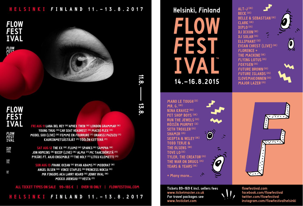
Take for example Bond Creative Agency’s work for FLOW Festival both in 2017, as well as in 2015 - 2016. The two projects featured from this multi-year collaboration show how Bond Creative Agency took two very different creative approaches. Each of these approaches encourage notes of intrigue and playfulness through their respective unique visual identities, while relying on very different types of imagery (raster vs vector), as well as color palettes and visual motifs.

Comparison of posters designed by Bond Creative Agency for Flow Festival 2015 – 2017
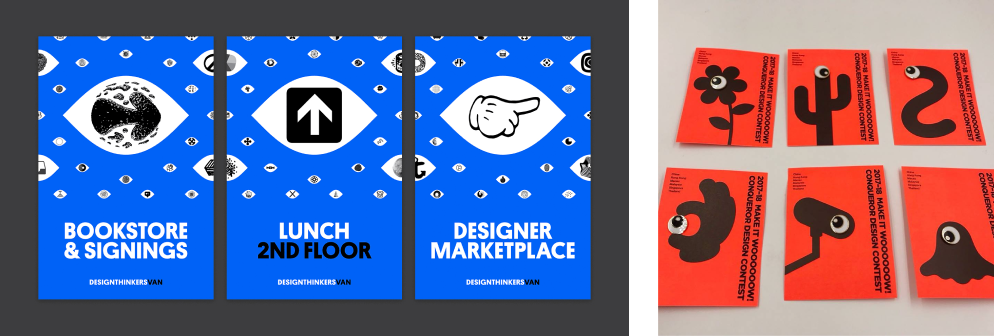
Along those lines, in terms of visual symbols the recurring visual pattern I noticed most involved eyeballs. I found this intriguing given that eyes are the windows to the soul, and it’s interesting to see how many different ways this visual motif was illustratively interpreted. For example, Rethink used the symbol of an eye as their starting point for Design Thinkers 2017, but then riffed upon that idea and expanded it into a visual language that extends beyond the basic symbolism of the eye. BLOW did something similar in their work for Conqueror Design Contest 2017, although with a more playful flair.

Comparison of posters designed by Rethink for Design Thinkers conference, and Make It Wow design contest collateral designed by Bond Creative Agency in 2017
Despite the breadth of visual styles in this book, one thing I noticed as a point of curiosity was the large number of sans-serif typefaces present in the featured work—both for latin and non-latin typefaces alike. There were still a few examples of display type and serif type in the featured visual identities, but they were definitely the exception.
This makes me wonder if this is a question of legibility and readability, because festival and environmental design need to be as accessible as possible for their intended audiences? Display typefaces in particular could very quickly become impediments in this respect. Although research on the comparative legibility and readability between serif and sans-serif fonts seems inconclusive, Massimo Vignelli’s work for the New York City subway system helped establish a precedent of sans-serif usage for public communications projects.
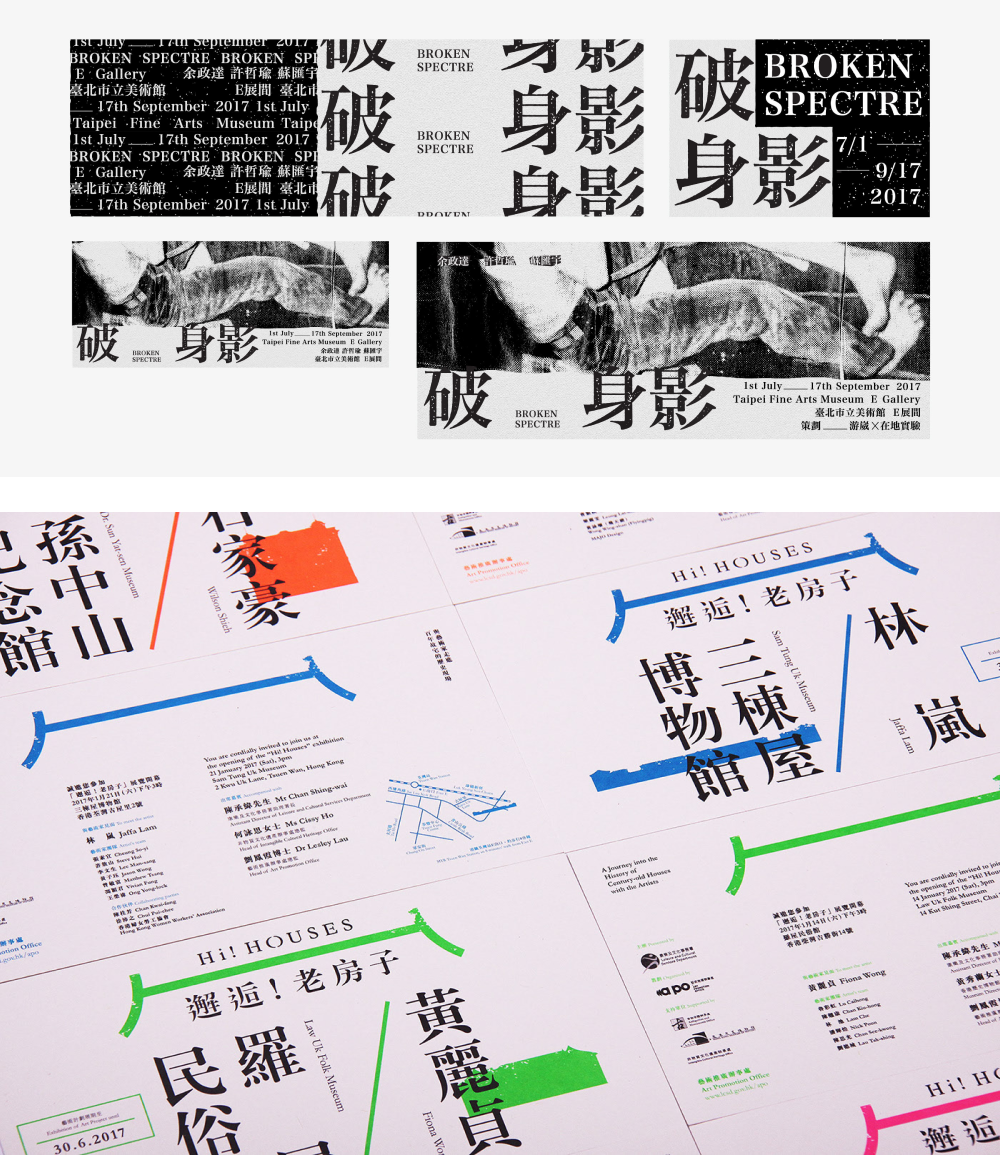
Having said that, despite the suffusion of sans-serif type in this book, I enjoyed the many examples it provided of latin and non-latin typefaces coexisting and interplaying in visual identities with each other, including Chinese, Korean and Japanese typefaces. 2017 projects like the Broken Spectre Exhibition by 0.00 Design and Risograph ROOM, as well as the Hi! Houses project by BLOW, and the Totem Run by Good Morning Design are just a few of the examples of this interplay of typefaces that stood out to me from “Graphic Fest.”

Posters and event graphics designed by by 0.00 Design and Risograph ROOM for Broken Spectre Exhibition 2017, along with Hi! Houses environmental graphics designed by BLOW in 2017, and Totem Run design system created by Good Morning Design in 2017
Do I recommend this book?
Overall, I love that this book has exposed me to more visual design work from parts of the world whose creative output I would otherwise find it difficult to find on my own, so yes, I recommend it. Sometimes it can be difficult to know where to start online because there’s so much to sort through, even when it comes to niche areas of design like event and environmental design. Books like “Graphic Fest” provide a shortcut for finding this kind of inspiration in a curated context, and they encourage you to look deeper into these design projects instead of taking them at face value.
Along those lines, I also enjoy that this book exposed me to various types of cultural events that have taken place around the world. From fashion trade shows, to music and film festivals, to design contests, to photography and art exhibitions, to academic capstone and degree shows, to city-wide library weeks, and so much more—this book reminded me of just how many different types of one-time and recurring public events exist, in need of visual design services. These types of events provide a unique opportunity for creatives to use design as an interface for public discourse.
The format Victionary chose also helped to highlight the similar community-based needs that arise for events that might otherwise seemed unrelated. Overall, “Graphic Fest” ventures beyond the realm of simple design inspiration by amplifying the public context within which so much design is created.